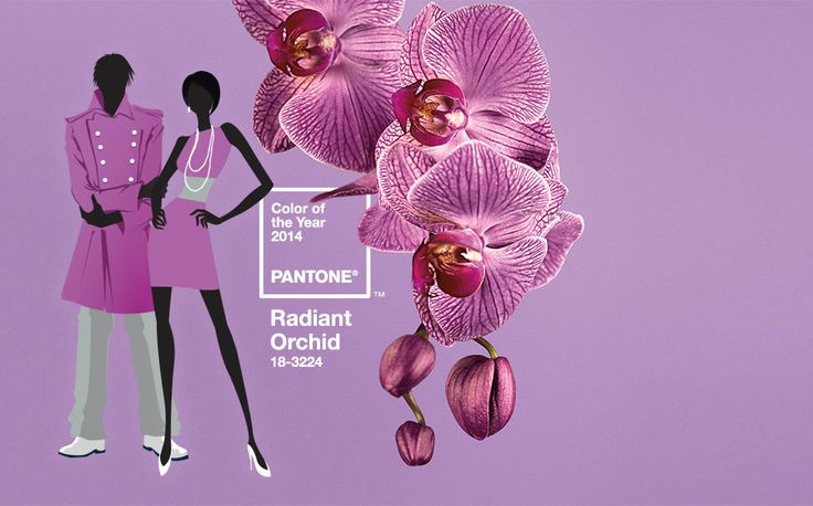
Pantone’s Colour for 2014: Radiant Orchid!

Ring in 2014 with Pantone‘s Colour of the year for 2014, “Radiant Orchid”! You can almost taste the tart sweetness of this soft yet sensuous hue of purple, described best by Pantone as “an enchanting harmony of fuchsia, purple and pink undertones.”
*For those unfamiliar with PANTONE, this company is the be-all-end-all of colour savviness. Their in-depth system of developing and cataloging colour swatches makes them the absolute standard and must-have design tool in all industries involving all things colourful. From prints to paints and bits to bites, Pantone touches all product surfaces physical, virtual and beyond.
Below, Colour Specialist and Pantone Colour Institute Executive Director, Leatrice Eisman introduces the 2014 Colour Report:
Let’s take a look at the qualities of “Radiant Orchid”:
- Expressive
- Exotic
- Confident
- Warm
- Creative
- Charming
- Energizing
When worn, the rose undertones cause a radiant glow on the skin, making both male and female wearers appear energized, rejuvenated and vital. This hue is bold without being overbearing.


I’m happy to say that the fashion colour forecast, as determined by an exclusive panel of industry specialists, is predicted to be much warmer and brighter compared to our deep-freeze winter temperatures. And since there’s no such thing as a monotone spring, Radiant Orchid will be accompanied by an array of soft pastels and vibrant tropical jewel tones that will eventually deepen and darken as we approach fall.


Inspired by the runways at New York Fashion Week this past September, we’re definitely looking forward to seeing if these soft and vibrant colour predictions carry through from the catwalks to our much anticipated spring city walks. Let’s keep our eyes peeled to see who revels or rebels the Pantone 2014 colour trends!


")
